Table of Contents
As an event professional, your website is a digital showroom that showcases everything you offer. It’s your opportunity to market your event business to your clients wherever they are and stand out against your competitors. It’s also one of the best ways to make a great first impression, since most people scope out a business online before making a purchase.
Your website also makes your party rental marketing efforts more measurable. Curious to know which of your services people are most interested in? How about the number of quote requests you get each month? Your website can help you unlock this information to make informed business decisions.
How to Develop a Party Rental Website Design Strategy
Either you have a website already, or you’re looking to build one. But how do you go about creating a website strategy that’s going to work for you and your event company?
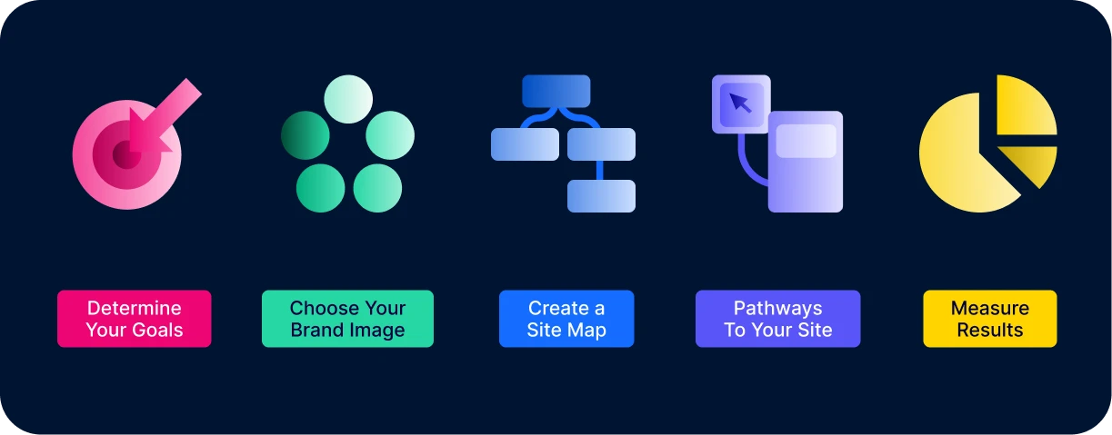
1. Determine Overall Goals for Your Party Rental Website
As an event professional, your main goal is likely to drum up more business. That means getting prospective clients to submit a quote request or get in touch with you about bookings. You may also have some smaller website goals, such as completing the sign-up for your newsletter, or downloading a how-to guide. You’ll want to prioritize your goals, then use your website to encourage visitors to complete those goals.
2. Choose Your Business Brand Image
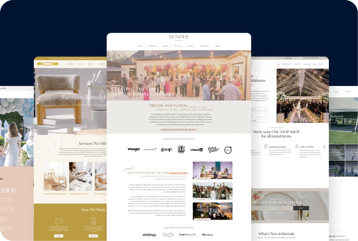
What message do you want to send to visitors when they’re on your website? Do you want to give off a clean, professional vibe like Kadeema Rentals or a fun, light energy like Party Bound? Everything on your website, from the colors and fonts to the images and layout, affects a visitor’s view of your brand.
⭐ Check out these 14 amazing event rental websites
3. Create an Outline of Your Site Map
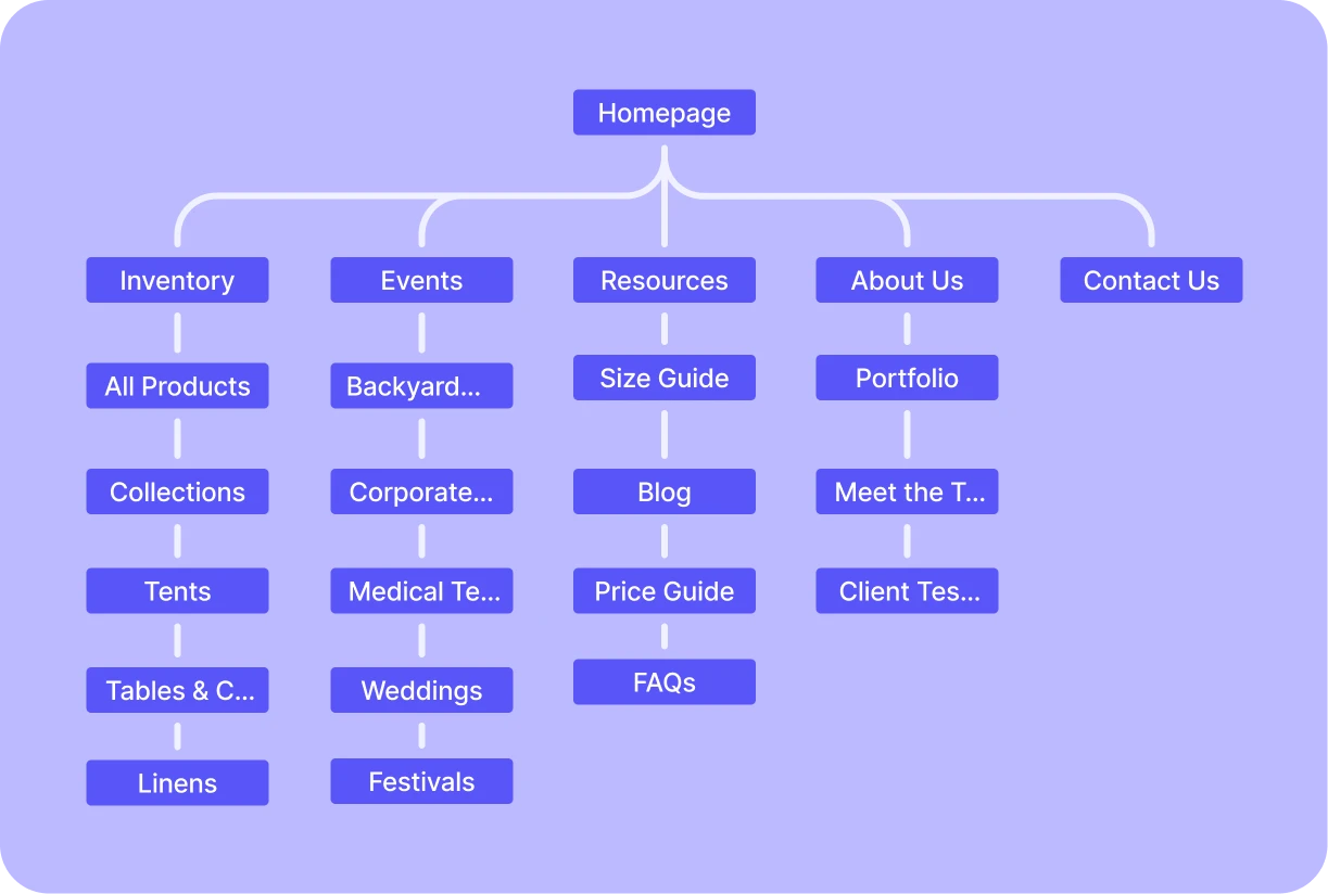
While you’ll eventually want a digital site map, you’ll first start out with a physical outline of how you want your website to be built. This means drawing out the way you want your menus and pages to link together.
4. Set Pathways for Visitors To Reach Your Website Goals
If your main goal is to get a visitor to contact you to start the quote process, then you want to make that as easy as possible for them. This means adding links to all your pages that go to the contact form, wishlist builder, or landing page — either by integrating calls-to-action (CTA) buttons or hyperlinks.
5. Continuously Measure Results and Make Improvements
Your website will constantly evolve as you better understand your traffic patterns and use tools like Google Analytics and Google Search Console to measure your website’s success. And the results pay off when you have an influx of clients coming in because they saw your professional, polished website.
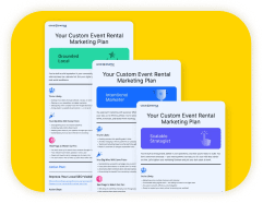
Want more bookings?
Take our free quiz to get a custom marketing game plan in minutes.
5 Tips for Party Rental Website Building
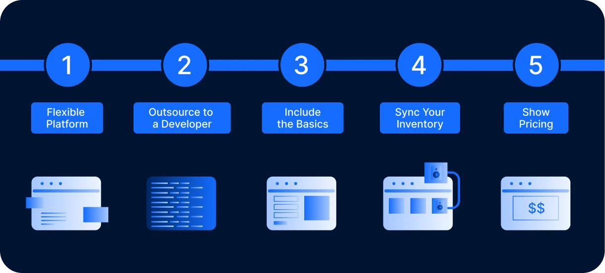
Now that you have your strategy in place, let’s talk about building the website itself. What do you include and where do you turn when you need help? Here are our top tips for building a stand-out party rental website.
1. Use a Flexible Platform
As a professional in the events industry, you have a keen eye. You know which sofas and loveseats go together and what accessories need to be included with folding chairs. A client, on the other hand, may be clueless. They may have a hard time visualizing what exactly they want for their special occasion, especially when browsing through inventory items piece by piece. So the ability to create packages on your website is a must.
2. Know When to Outsource to a Developer
If you’re just creating a simple event rental website, you may be able to design it yourself using a drag-and-drop website builder platform. We recommend Squarespace and WordPress, but there are plenty of user-friendly options to choose from. On the other hand, if you want to include a lot of custom elements, working with a developer is an option. Here are a few of our trusted developer recommendations.
⭐ How to choose a website builder for your business
3. Include the Basics
You don’t want to forget to include the areas you serve, your contact information, and how the renting process works. This information can be invaluable to customers, so they don’t have to go digging for it. Some event companies even choose to include a website page responding to FAQs.
4. Sync Your Inventory With Your Website
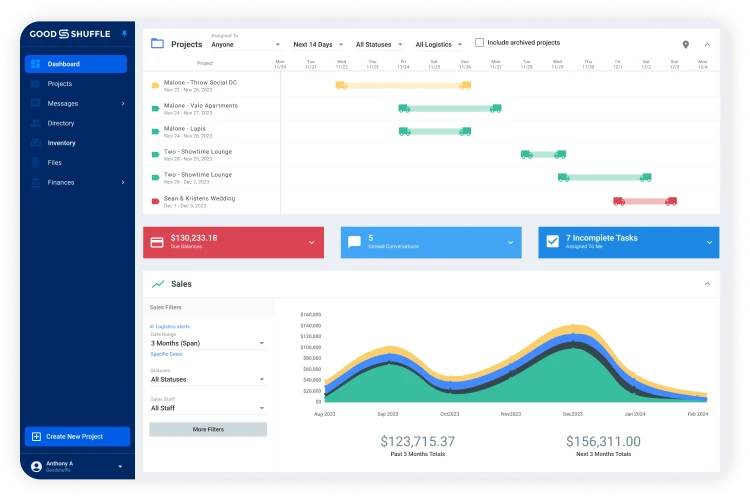
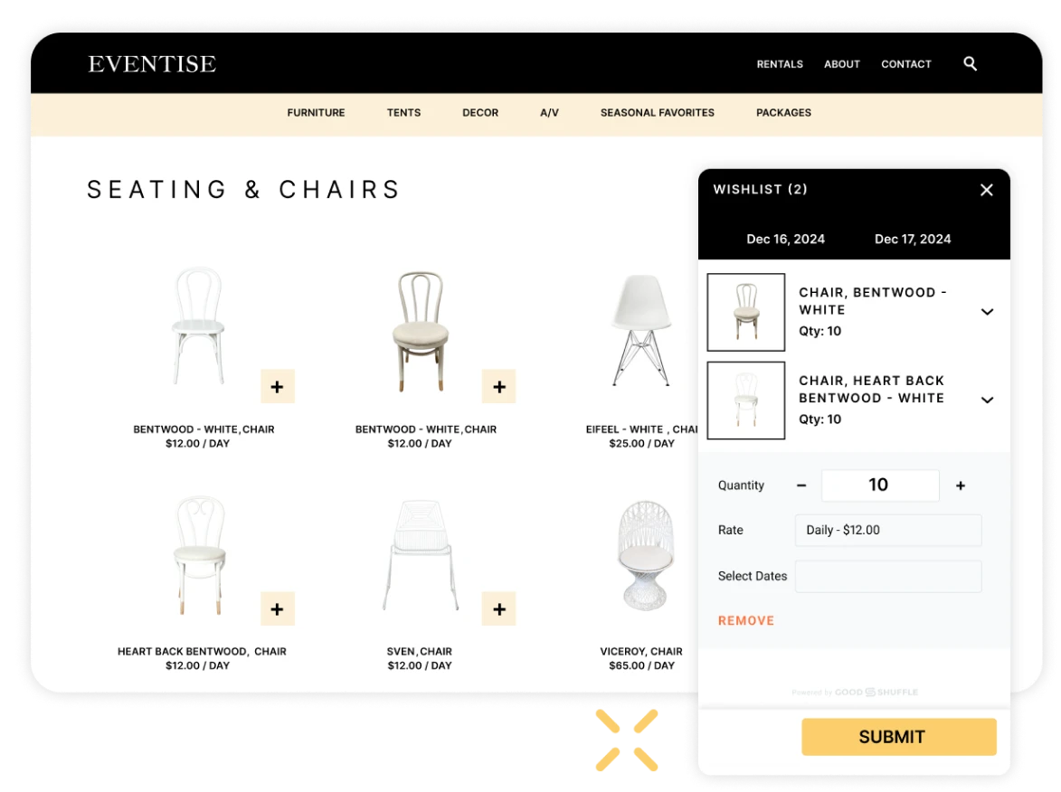
What if we told you there was a way to list all of your inventory items and packages on your website automatically? Goodshuffle Pro’s Website Integration does just that, so you can display all of your chairs, tables, tents, and linens to your customers, complete with pictures so they know what to expect.
5. Show Your Pricing
By hiding your prices, you’re asking potential customers to make a leap of faith by reaching out to you. They’re much more likely to just go somewhere else where they know what to expect. Prices don’t scare away qualified customers — they simply weed out unqualified leads.
All Things SEO for Events Professionals
You’ve spent all this time creating a website. Don’t you want people to see it?
That’s where SEO comes in. It may seem like a fancy acronym, but it’s a simple concept. It stands for search engine optimization, and it means you’re creating a website that can be found by search engines — and crucially, the people who use them.
What Are the Benefits of SEO?
SEO is one of the best marketing strategies for event professionals because it:
- Brings in more new, qualified leads to your business.
- Makes you stand out from competitors.
- Is cost-effective, since you’re targeting people who are actively searching for information on a certain topic.
And that’s not to mention the benefits of brand credibility and higher click-through rates compared to paid ads. SEO can help your event company’s website move to the top of Google, grabbing the #1 spot over your competitors.
Three Core Components of SEO
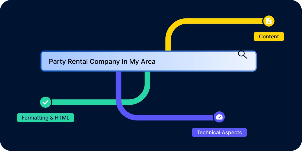
So you know what SEO helps with, but what does it involve on your end? The three core components are:
- Formatting and HTML: This is about structuring your website so it’s easy for search engines to read. Think of it as the blueprint that ensures everything from your headers to your meta descriptions is in the right place.
- Content: The heart of SEO. Your blog posts, product descriptions, and service pages should be packed with relevant keywords, engaging information, and value to both users and search engines.
- Technical aspects: The behind-the-scenes stuff — like site speed, mobile-friendliness, and security — that ensures your site runs smoothly and meets search engine standards.
Everything from titles and alt text, to keywords like “vintage wedding Nashville” or “moon bounces” impacts your SEO. We’ve put together an SEO crash course for you here:
How to Improve SEO in 5 Steps
Here are some quick win SEO tips for your event rental company:
- Optimize inventory listings: Use clear, keyword-rich titles and descriptions for your inventory items. Include high-quality images with alt text, which is a brief description of an image that helps search engines understand what the image portrays.
- Start a blog: Write about event trends, tips, and success stories. It keeps your site fresh and helps with keywords — plus provides inspiration to your clients.
- Improve page speed: Compress images and minimize code. Faster sites rank higher.
- Claim and optimize Google Business Profile: Ensure your business listing is up-to-date with accurate info, photos, and reviews to boost local search visibility.
- Get quality backlinks: Partner with local venues or event planners to exchange backlinks. Quality links from reputable sites boost your SEO authority.
UX Basics for Event Professionals
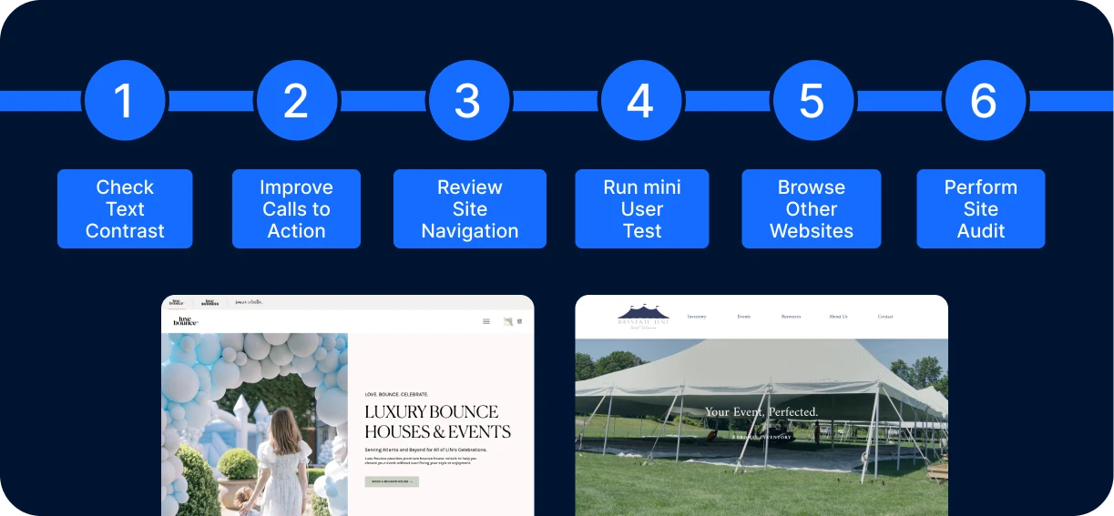
UX, or user experience, is a user’s overall experience with your website. You want to design a website that gives your visitors the best possible user experience — easy to use and highly functional.
Why UX Matters for Your Event Company’s Website
SEO is what first gets people to your website, but UX is what makes people stay. User experience is important because it:
- Engages and entices visitors.
- Solidifies a first impression.
- Makes it easy for visitors to complete the ultimate goal (e.g. submitting a form, sending an email).
4 Guiding UX Principles
When thinking about UX, you’ll consider everything from fonts and color scheme, to calls-to-action (CTAs), plus the time it takes for the website to load. Do you have lots of stock photos or confusing language? Both of these make for a less-than-ideal user experience. You should also ask yourself if you are giving your users a clear way to contact you or take some other next step.
The four cornerstones of UX are:
- Design with the user in mind.
- Be consistent across all content and pages.
- Clarity is key.
- Simplistic designs are often the best.
6 Ways to Quickly Improve Your Website’s UX
Here are six things you can do to easily get your website’s UX up to par:
- Check text contrast: If there isn’t enough contrast between text and images or background, it becomes hard to read and easy to miss. Your website should be accessible to as many people as possible and draw attention to the most important information.
- Improve calls to action: Be specific and transparent with your CTAs. The visitor should know what clicking on a CTA will do. Keep the language strong, short, and concise.
- Review site navigation: Look at the navigation menus on your website. Are the page titles clear and logical? Do they lead to the correct page? Are dropdown menus organized? A user should be able to find everything they need in your top menu.
- Run a mini user test: Find a friend who isn’t familiar with the website. Ask them to click around and explain their thought process as they explore your site. Use this feedback to make an improvement plan.
- Browse other websites: Take note of your experience using other websites. Figure out what you like, and what frustrates you. Then, use this information to learn and make improvements on your own site.
Perform a site audit: Take note of anything that would harm a user’s experience. This includes broken links, outdated information, funky formatting, and anything else that could be confusing.
How to Conduct a Website Audit
Speaking of site audits, they’ll help you determine what needs fixing with your overall website, as well as the individual pages.
A website audit generally improves your technical and SEO performance, which translates into more paying customers.
Areas to Observe in a Website Audit
It’s important to know what to pay attention to and measure when performing a website audit.
After you’ve analyzed your web traffic and page performance, you’ll have a good idea of your business goals for your website. Do you want increased traffic? More conversions? A more professional user experience? Whatever your goal is, be sure to have it in mind when you’re performing your audit.
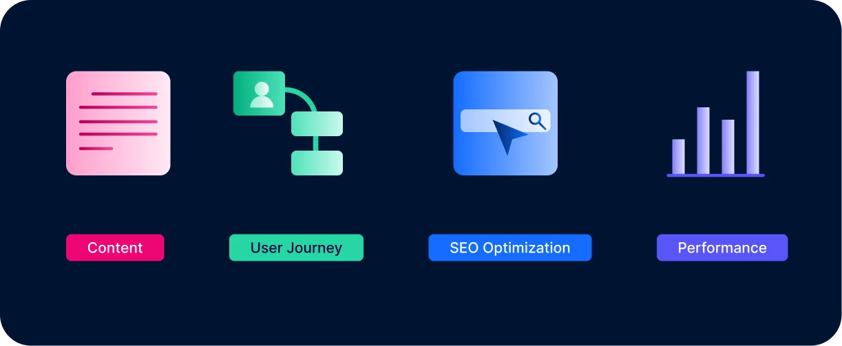
When auditing, you should always review:
- Content
- User journey and experience
- Optimization for search engines
- Technical performance
You can do this with various tools, which we’ll get into next.
5 Best Website Audit Tools
1. Woorank
Woorank provides a lengthy site analysis report that dives into a bunch of different areas, including SEO, usability, social media, and more.
2. Moz
Moz is an all-in-one SEO tool that highlights broken links, duplicate content, issues with meta descriptions, and more. You can check your keyword rankings and your inbound link status here as well.
3. Check My Links
This free Chrome extension detects and highlights broken links on any webpage. Say goodbye to 404 error pages.
4. Screaming Frog’s SEO Spider
Screaming Frog’s SEO Spider looks at your website and flags any areas that require SEO improvement. Audit redirects, find duplicate content, generate sitemaps, and more with this tool. You can crawl 500 URLs for free to try it out.
5. Google Search Console & PageSpeed Insights
These free tools from Google — Google Search Console and PageSpeed Insights — give you insight into your entire website’s performance. Learn hot keywords in your market, find URL errors, and identify areas of improvement for page load speed.
How Do I Bring My Website to the Next Level With Event Rental Software?
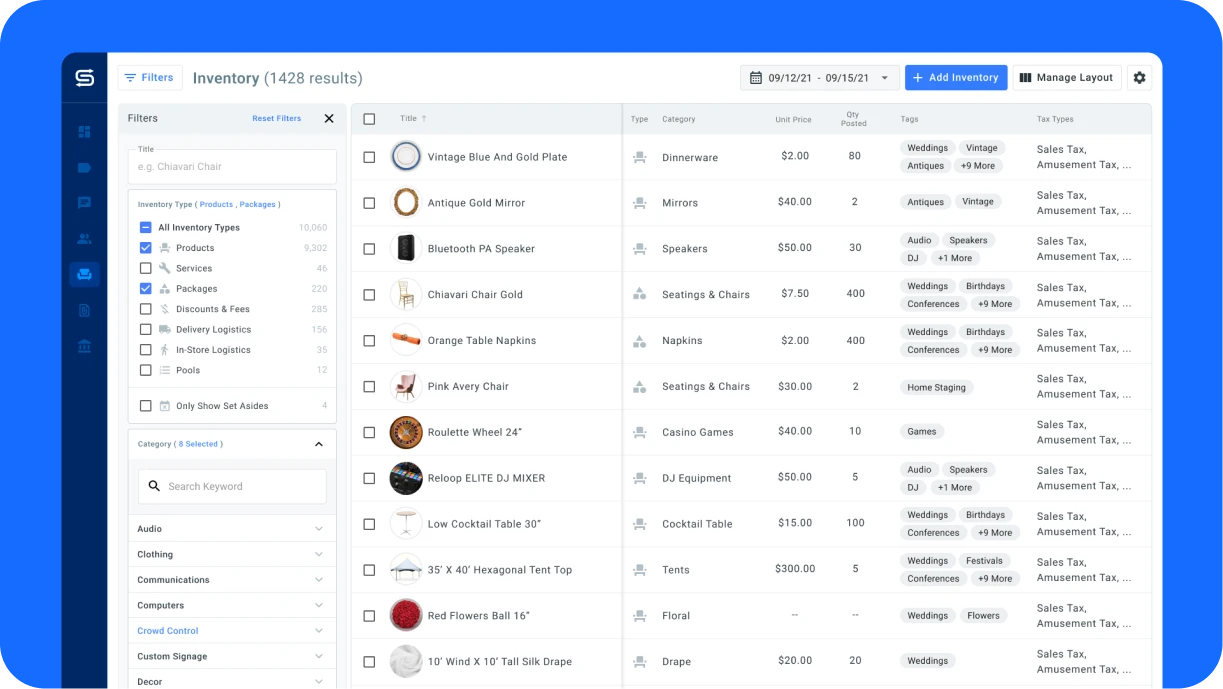
As your digital showroom, your website should represent your brand and be well maintained. But keeping it updated can be complicated and time-consuming, especially when you work in an industry as fast-paced as events.
That’s why Goodshuffle Pro offers a Website Integration. It pairs with your website, automatically syncs with your inventory, and allows potential clients to submit a wishlist to you. Then, the software automatically creates a proposal in Goodshuffle Pro, which you’re free to adjust before sending the final quote.
The Website Integration allows you to quickly respond to clients without back-and-forth phone calls or emails — while still allowing you to maintain full control of the sales process.
Goodshuffle Pro users have seen up to a 95% decrease in the amount of time they spend on their website. Are you ready to experience that impact for yourself?
